There was a time when people carefully read websites line by line. Today, most users scan pages quickly instead of reading every sentence.
In just a few seconds, visitors decide:
- Does this website feel trustworthy?
- Is this easy to understand?
- Can I quickly find what I need?
- Or should I leave?
And most of this decision happens before they read a full sentence.
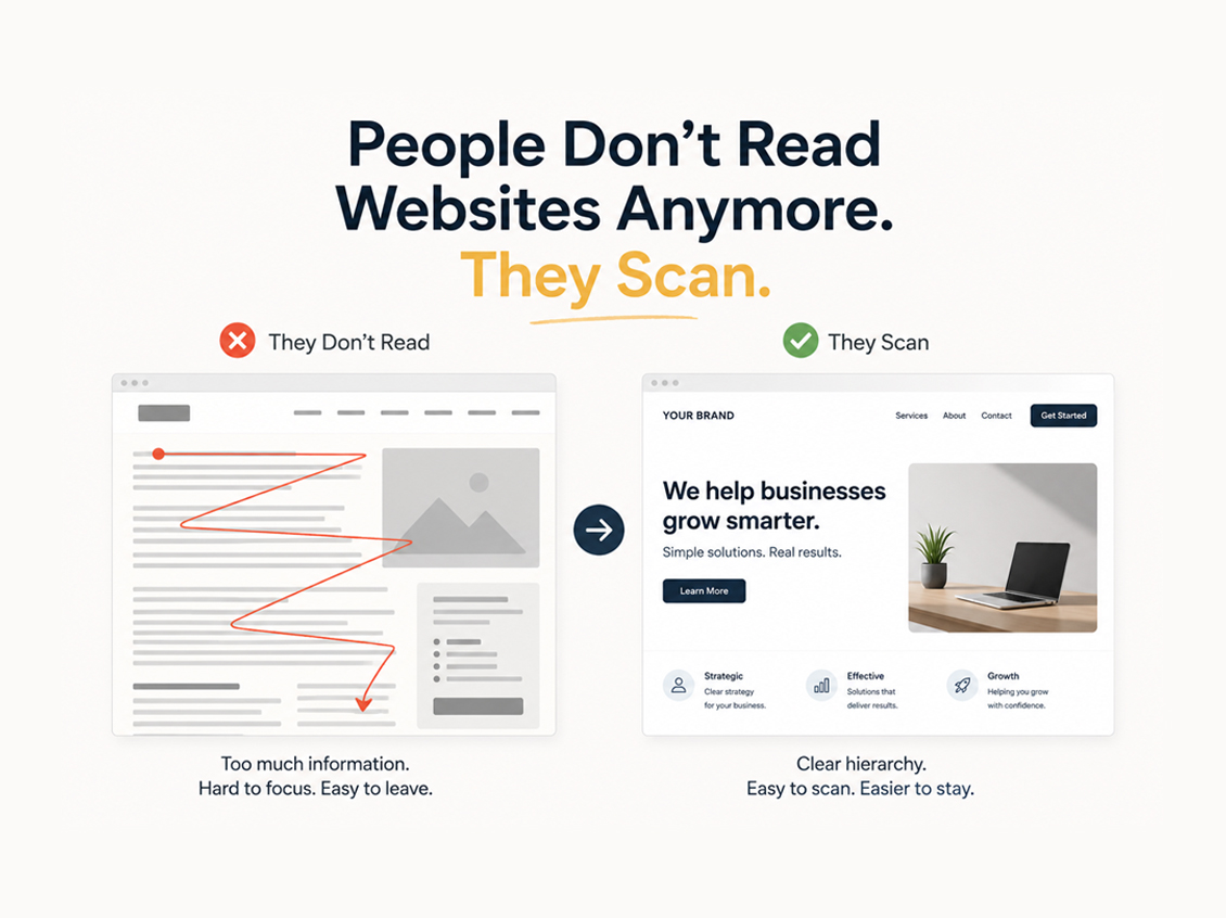
Why People Don’t Read Websites Anymore
Modern websites are competing against:
- notifications,
- short videos,
- endless scrolling,
- and shrinking attention spans.
Especially on mobile devices, users move fast.
They don’t carefully study every section anymore.
Instead, they quickly look for:
- headlines,
- buttons,
- images,
- spacing,
- and visual clarity.
If the page feels overwhelming, confusing, or too dense, many users simply leave.
Not because the business is bad.
Because the experience feels difficult.

What Happens When People Don’t Read Websites
When someone opens a website today, they usually notice these things before the actual content:
1. Clean Layout
A crowded page feels stressful.
Too many colors, boxes, animations, or text blocks can make visitors lose focus immediately.
Simple layouts often feel more modern and trustworthy.
2. Easy-to-Read Headlines
Most users scan headlines first.
Good headlines help visitors understand:
- who you are,
- what you do,
- and why it matters.
If visitors cannot understand the message quickly, they may never continue scrolling.
3. Mobile Experience
A website might look great on a desktop but frustrating on a phone.
And in 2026, mobile experience is no longer optional.
Spacing, font size, button placement, and loading speed all shape the first impression.
4. Visual Breathing Room
White space is not “empty space.”
It helps users focus.
Modern websites often feel easier to navigate simply because they give content room to breathe.
Scanning Is Not a Bad Thing
This shift does not mean people care less.
It simply means digital behavior has changed.
Users process information faster now.
Good websites adapt to that behavior instead of fighting against it.
The goal is no longer:
“Make visitors read everything.”
The real goal is:
“Help visitors understand everything faster.”
We discussed similar user behavior challenges in our article about why websites don’t convert.
Simple Often Wins
Many small businesses think they need:
- more text,
- more animations,
- more pages,
- more content.
But often, a clearer structure creates a better experience than adding more information.
Sometimes, improving a website is not about redesigning everything.
Sometimes it is simply about making the message easier to scan.
The reality is simple: people don’t read websites anymore. Modern users scan for fast answers and clear experiences.
At Howdy TX, the focus is simple:
👉 Turning ideas into clear and effective digital experiences that actually work.
Leave a Reply